Trending Window Covering Colors for 2026
Color trends in home decor shift gradually, but window treatments tend to lag behind wall paint and furniture. That's partly because they're a bigger commitment. You can repaint a wall in a weekend; replacing blinds or shades across multiple rooms is a different kind of project. Which is why it pays to know where colors are heading before you order.
Heading into 2026, the direction is clear: warmth over cool, muted over saturated, and natural over stark. The cool grays and bright whites that dominated interiors for most of the past decade are still around, but they're steadily getting replaced by earthier, softer palettes that feel more lived-in.
Here's what's gaining traction.
Warm Neutrals Are Replacing Cool Grays
For years, cool gray was the safe, versatile choice for window treatments. It worked with almost anything and photographed well. But the broader shift toward warmer interiors has made cool gray feel dated in a lot of spaces.
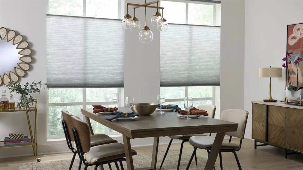
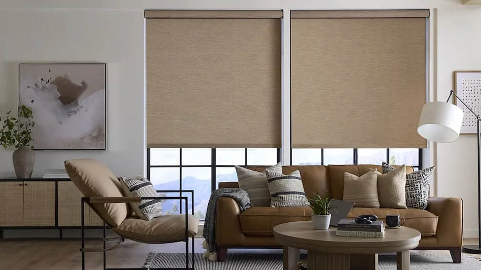
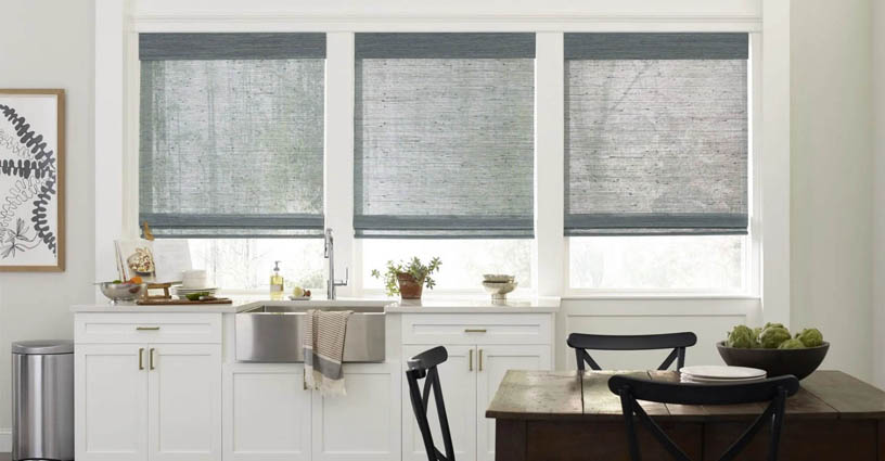
Warm neutrals, think linen, sand, warm taupe, and greige (gray-beige blends that lean warm), are taking their place. These hues complement wood floors, natural textiles, and the warm-toned furniture that's become dominant in home design. Neutral enough to be versatile, yet warm enough to feel intentional rather than generic.
For window treatments specifically, warm linen colorways are having a strong moment. Cellular shades and roller shades in linen or flax add visual texture without competing with anything else in the room. Roman shades in warm off-white and greige suit spaces that want a polished look without a color statement. Short of repainting the walls, few changes move a room's warmth dial more noticeably.
Earthy Tones: Terracotta, Clay, and Rust
These weren't going away after 2024, and they're not disappearing in 2026 either. Terracotta, clay, and rust hues have proven to be more than a passing trend, rooted in natural materials and particularly well-suited to spaces with exposed wood, stone, or concrete elements.
As an accent rather than a room-wide commitment, earthy colors make the most sense in window treatments. One set of Roman shades or bamboo shades in a rust or clay colorway can anchor a space without overwhelming it. Neutral walls with natural materials elsewhere let the treatment read as intentional rather than loud.
These hues are also reasonably forgiving as fabrics age. Unlike some bolder colors that can appear washed out over time, earthy palettes tend to shift subtly rather than dramatically, though all window treatment fabrics are subject to UV exposure in the long run.
Muted Greens: Sage, Olive, and Moss
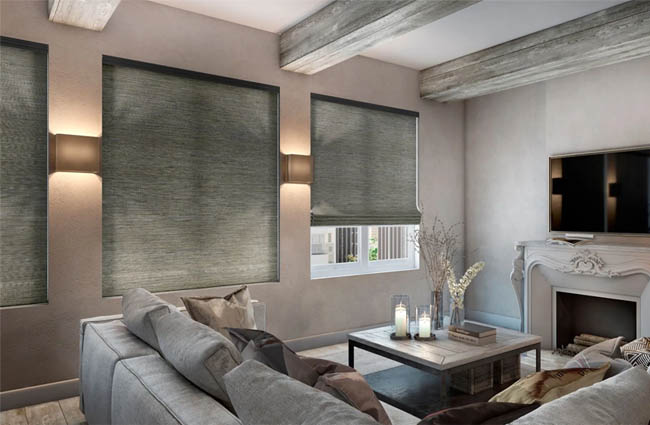
Green has been building momentum for several years, and 2026 may be its strongest showing yet in window treatments. Not the bright, saturated versions of earlier trends, but quieter, more complex ones: sage, dusty olive, and deep moss.
Sage is the most accessible entry point. Muted enough to function almost like a neutral in the right space, it pairs naturally with warm woods, cream, and linen textures. Roller shades and cellular shades in sage have become a go-to for living rooms and bedrooms that want color without a heavy commitment.
Olive and moss push further toward depth and richness. These suit rooms where you want the window treatment to be a deliberate design element rather than background. A set of Roman shades in deep olive in a reading room or study creates a cozy, purposeful atmosphere that lighter colors don't quite deliver.
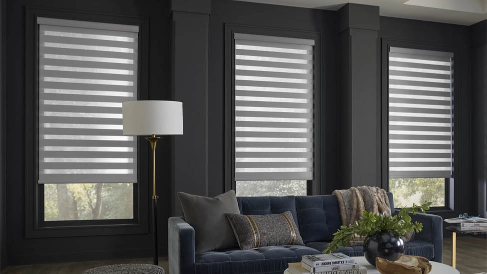
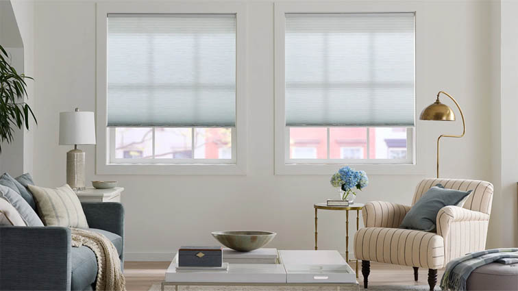
Dusty Blues and Soft Teals
Cool hues aren't disappearing entirely. They're just getting softer and more complex. The stark navy and bright teal of earlier years are giving way to dusty, muted versions that feel more refined.
Dusty blue is a strong choice for bedrooms and bathrooms, particularly in rooms with white or off-white walls. It reads calm without going cold. Brass and gold hardware, still prominent in interior design, pairs naturally with it as well.
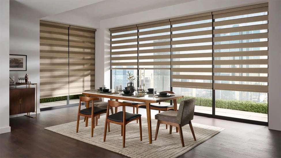
Soft teal sits between green and blue in a way that makes it surprisingly flexible. Coastal-influenced spaces can use it without leaning into cliché, and contemporary interiors with clean lines absorb it naturally. For sheer shades or zebra shades, soft teal adds color while still allowing light through in a way that feels airy rather than heavy.
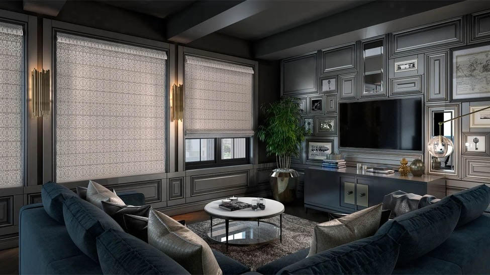
Deep, Moody Colors for the Right Spaces
Not every room calls for a soft, muted palette. Deep colors are doing well in spaces designed for atmosphere: home offices, dining rooms, media rooms, bedrooms where you want the space to feel more enclosed and intentional.
Forest green, deep burgundy, charcoal, and navy all suit blackout cellular shades or blackout roller shades in rooms where light control matters. One practical consideration worth knowing: darker fabrics can show UV fading more noticeably over time because the contrast between faded and unfaded areas is more visible. A room with intense direct sun all day may not be the best candidate for your darkest option.
When you go dark, commit to it. A deep forest green roller shade paired with complementary wall color and rich wood furniture creates cohesion. Using a dark treatment while keeping everything else light can feel disconnected unless you're deliberately using it as a contrast point.
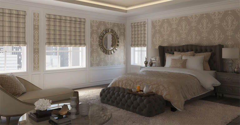
Warm Whites and Creams Are Not the Same Thing
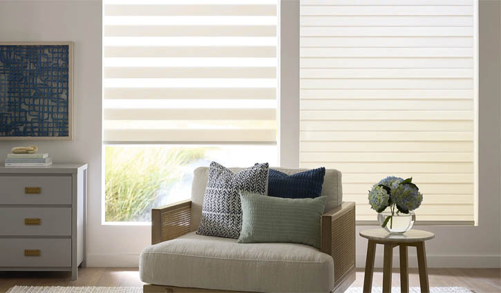
This distinction matters more than most people realize. Pure white window treatments, especially bright or cool whites, can look stark against warmer interiors. If your walls, flooring, and furniture are trending warm, a bright white shade will stand out in the wrong way.
Cream, ivory, and warm white colorways blend naturally into warmer spaces. They still read as light and airy, just without the clinical edge that pure white can create. For rooms where you're not making a color statement and want the treatment to recede visually, warm white is almost always the better call.
Applying These Trends Without Regretting Them in Two Years
Knowing what's popular is useful. Knowing how to apply it without ending up with a room that feels dated fast is the more practical question.
A few things worth keeping in mind:
Match your undertones. If your walls and floors carry warm undertones, lean toward warm neutrals, earthy hues, and muted greens. Cool walls pair better with dusty blues and soft teals. Mixing warm and cool undertones in the same room rarely lands well.
Consider light direction. North-facing rooms tend to read cooler and can handle warmer colors to compensate. South-facing rooms get warm, saturated light that can make already-warm colors feel intense by midday. A muted sage or dusty blue often reads better in a sunny south-facing room than a terracotta that competes with the light rather than working with it.
Don't over-coordinate. Window treatments don't need to match your throw pillows or artwork exactly. They need to belong to the same color family. There's a meaningful difference between those two things.
Account for color shift in fabric. Colors look different on a screen than in person, and fabric texture affects how a color reads in a room. When ordering custom shades or blinds, getting a physical sample swatch before committing can save you from a result that doesn't match your mental image. Blindster offers free swatches on all products, so it's worth getting samples before you order.
The broader takeaway is that 2026 color trends in window treatments are extensions of where interiors have been heading: warmer, more natural, quieter. If you've already shifted toward a warm neutral palette in your home, you're closer to current than you might think.
- Dining Room Window Treatments: Light, Privacy & Style GuideBlinds, Shades & ShuttersDesign & Decor
- Statement Window Shades IdeasBlinds, Shades & ShuttersDesign & Decor
- Trending Window Covering Colors for 2026Design & Decor
- Color Drenching for Window CoveringsBlinds, Shades & ShuttersDesign & Decor
- The Fastest Way to Change a Room's Look? Start With the WindowsBlinds, Shades & ShuttersDesign & Decor