Color Drenching for Window Coverings

Color drenching has moved from design magazines into real living rooms, and the appeal is easy to understand. The technique involves coating an entire room in one color: walls, ceiling, trim, baseboards, door frames, all of it. The result is a space that feels deliberately designed rather than thrown together, with a depth that a standard painted room rarely achieves.
Window coverings are where most people undermine the whole thing.
Weeks of deliberating over the perfect dusty sage or warm terracotta, every surface painted flawlessly, then white roller shades go up because they "go with everything". They don't. White goes with nothing when the rest of the room is a unified color. It sticks out like a patch of missed wall, and the intentional effect collapses. Getting color drenching right means treating your window treatments as part of the color palette, not an accessory added after the fact.
What Color Drenching Actually Means
The term gets used loosely enough that it's worth being precise. True color drenching means applying one color, or closely related tones of it, to every surface in a room: walls, ceiling, trim, baseboards, door frames. Some designers extend it to furniture upholstery, built-ins, and window treatments. The goal is to eliminate visual breaks that pull the eye out of the space.
It's different from an accent wall. Choosing a three-color palette is a different approach entirely. Color drenching is singular and committed.
Designers and color theorists widely hold that rooms with continuous color tend to feel larger and more purposeful, because the eye doesn't snag on contrast points and moves through the space freely. That's part of why deep, saturated colors, which traditionally read as space-shrinking, can open up a room when applied consistently across every surface.
Window Coverings Make or Break the Look
Here's the practical reality. Window coverings take up a substantial portion of wall space, especially when mounted wide to maximize the visual size of the window. A standard 36-inch window with treatments mounted six inches beyond the frame on each side puts 48 inches of coverage on the wall. In a small bedroom or study, that's a significant percentage of visible surface area.
If those treatments are the wrong color, the drench breaks. The eye locks onto the discrepancy, the immersive effect disappears, and the room looks like someone ran out of paint before finishing. The fix isn't complicated, but it requires planning: treatments that either match the wall color closely, sit within the same color family, or are intentionally chosen as the single opposing element in an otherwise drenched room.
That last option can work beautifully. But it has to be a choice, not a default.
Matching vs. Tonal Harmony: How Close Is Close Enough?
Exact color matching between paint and fabric is harder than it sounds. Paint colors are produced with pigments; fabrics are dyed. The two rarely produce identical hues even when they share a name. Light compounds the problem. A matte wall in deep navy reads differently than a polyester roller shade in navy blue under the same light source, because the surface finishes interact with light in different ways.
Most designers working with color drenching aim for harmony within a color family rather than exact matching. The window covering sits close enough to read as part of the palette without drawing attention to itself.
A deep green room might call for a shade that's slightly lighter or more muted than the wall color. Warm terracotta pairs well with a roman shade in sienna or rust, which maintains the palette without requiring a perfect dye alignment. The key is avoiding colors that introduce new undertones. A warm-toned room with cool-toned window coverings breaks the drench even if both colors are technically neutral.
If you want the closest possible result, order fabric swatches before committing. Hold them against the painted wall in both natural and artificial light. Colors shift significantly depending on exposure, and what looks right under a showroom's fluorescent lighting may look completely wrong in a south-facing bedroom at noon.
Which Window Coverings Work Best for Color Drenching
Not every product type lends itself equally to the technique.
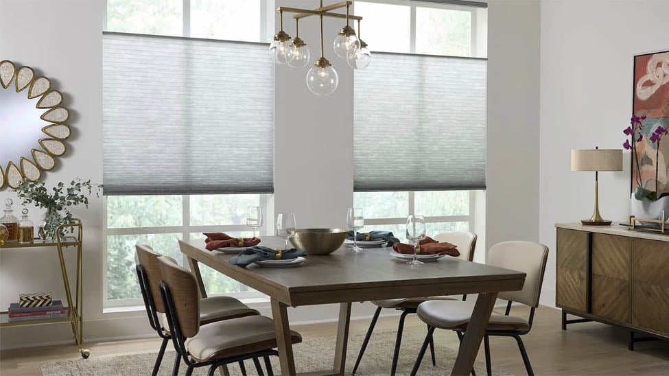
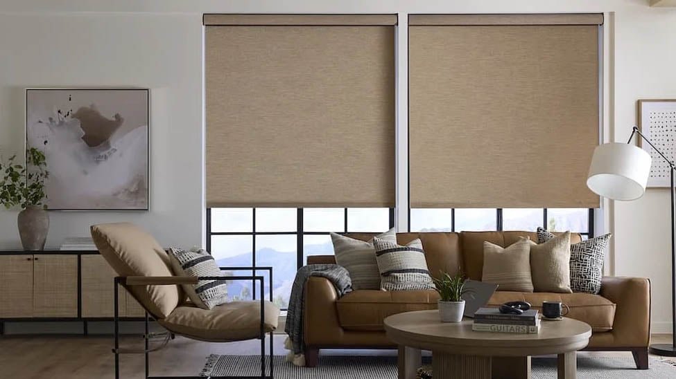
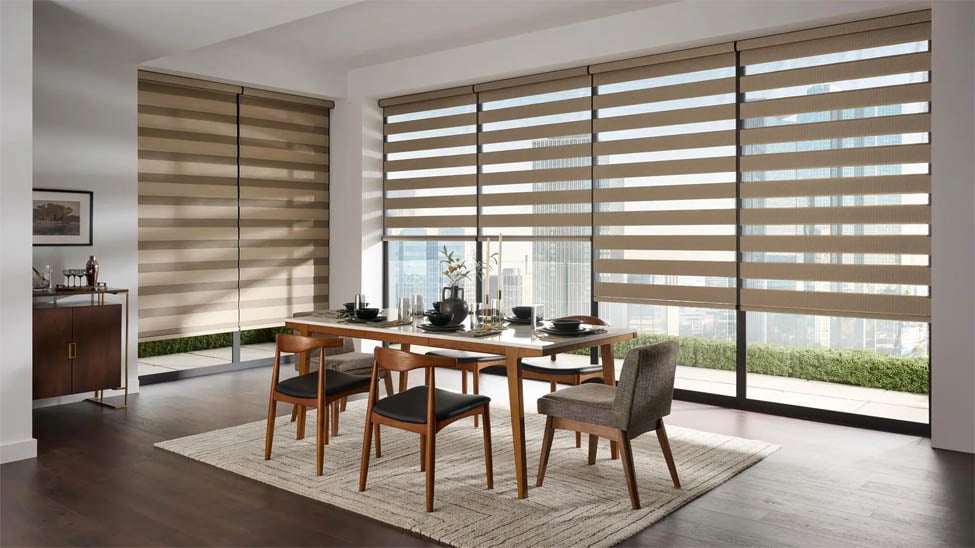
Roller shades are one of the strongest choices. They're available in a wide range of solid colors, have a clean flat profile when raised, and don't introduce pattern or texture that competes with the wall. For a room where color consistency is the priority, that simplicity works in your favor.
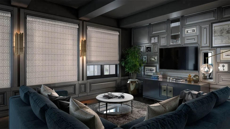
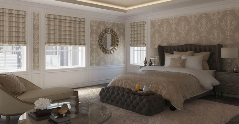
Roman shades take a different approach: the horizontal folds create visual interest and texture without fracturing the palette, which makes them worth considering for rooms where you want the drenched effect but don't want the space to feel flat. Solid fabrics keep the color reading clean, even with the added dimension.
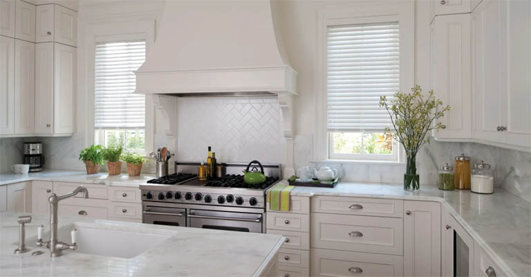
Cellular shades work particularly well in neutral-drenched rooms: whites, creams, warm grays. Their honeycomb structure adds subtle texture without pattern, and they're widely available in neutral solid tones. For deeply saturated colors, fabric options can narrow depending on the manufacturer, so confirming availability before painting is smart.
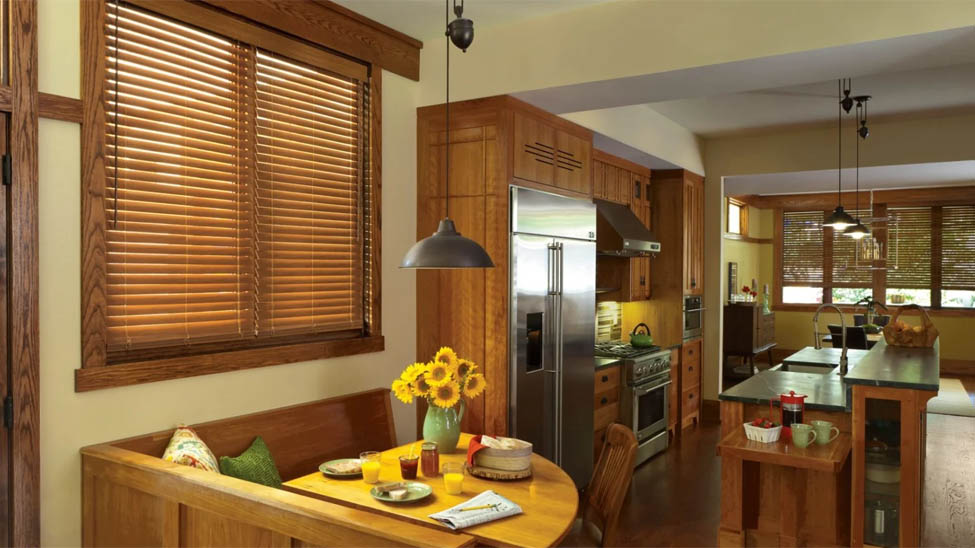
Faux wood blinds behave differently from flat shades. The slat structure introduces horizontal lines that create visual movement, which can add warmth and dimension or feel busy depending on the room's proportions and how saturated the color is. For spaces with natural wood elements, faux wood blinds in a complementary tone can reinforce the palette rather than compete with it.
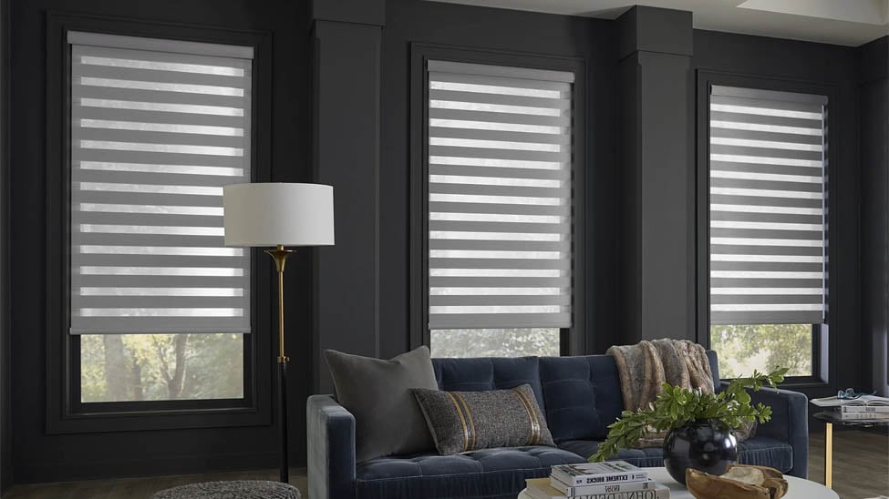
Sheer shades are worth considering for rooms with strong direct light. A sheer in a coordinating color filters light while maintaining the palette, and the diffused glow can deepen the drenched effect rather than wash it out.
Paint First, Then Order
Paint first, then order your window treatments. This seems obvious, but reversing the sequence is a common mistake. Paint colors shift on walls. What looks like a cool gray on a chip reads warmer once it's on four walls and a ceiling with natural light bouncing around. Order fabric swatches after the paint is up and fully dried, evaluate them in the actual room at different times of day, then place your order.
Coverage matters as much as color. Treatments that don't span the full window frame, including adequate overhang on each side, create gaps that break visual continuity just as effectively as a wrong color. Blindster offers custom sizing by the inch, which gives you the control to get coverage exactly right rather than approximating with standard sizes.
When Your Exact Color Doesn't Exist in Fabric
Sometimes the color you've committed to isn't available in any window covering fabric. This happens most often with specific designer paint colors, custom mixes, or shades with unusual undertones that don't translate cleanly to dyed fabric.
The practical solution is working within a tonal range rather than searching for an impossible match. Pick a fabric that shares the dominant undertone of your wall color and sits within two or three shades of the same value. A deep eggplant room pairs well with plum, burgundy, or deep mauve, even if none of them align precisely with the wall. The continuity of the undertone carries more weight than the specific hue.
If you're genuinely stuck, a neutral that disappears can work as a non-competing element. Warm white for warm-toned rooms, cool white for cool-toned rooms. It won't reinforce the drench, but it won't fight it either. That's a different outcome than the immersive effect, but it's a clean one.
What you want to avoid is the accidental near-miss: a treatment that's close to the wall color but not close enough, sitting in that awkward middle ground where it reads as an error rather than a decision. Too similar to register as deliberate contrast, too different to blend. When in doubt, go darker within the same family. Deeper tones tend to anchor a drenched room more effectively than lighter ones that drift toward neutral.
- Dining Room Window Treatments: Light, Privacy & Style GuideBlinds, Shades & ShuttersDesign & Decor
- Statement Window Shades IdeasBlinds, Shades & ShuttersDesign & Decor
- Trending Window Covering Colors for 2026Design & Decor
- Color Drenching for Window CoveringsBlinds, Shades & ShuttersDesign & Decor
- The Fastest Way to Change a Room's Look? Start With the WindowsBlinds, Shades & ShuttersDesign & Decor